The palette is the overall color theme that an illustrator chooses. We all know how the color of a room can affect our feelings. The same holds true for the picture book page.

Of course, the illustrator is chosen by the art director and/or editor because their style reflects the tone and the mood of the book. But, that can be manipulated and enhanced by the color choices that the illustrator selects. The illustrator might not have a palette restriction for the entire book, but also might switch within the story to help narrate the mood and setting.
I recently illustrated a picture book by Suzanne Slade, for Charlesbridge Publishing titled, “The Inventor’s Secret”. It’s about the friendship between Henry Ford and Thomas Edison. In Suzanne’s narrative she switches back and forth between the two inventors. Art Director, Whitney Leader-Picone and I felt that a palette shift between the two characters would help differentiate between the two. So Henry, the inventor whose passion was rusty gears, brass tools, oil and worn car parts, would be warm browns, sepia, and ochre hues. Thomas, more of a chemical inventor, conjured up thoughts of metal, industrial test tubes, and concoctions in apothecary jars. So Thomas’s palette would be cool blues, purples, and slate grays.
Since that project, I’ve been paying a lot more attention to how, and why, the artist selects their color scheme and I’ve found it to be very interesting. Here’s a photo of my latest library haul. Just look at how the different color choices reflect the stories inside!
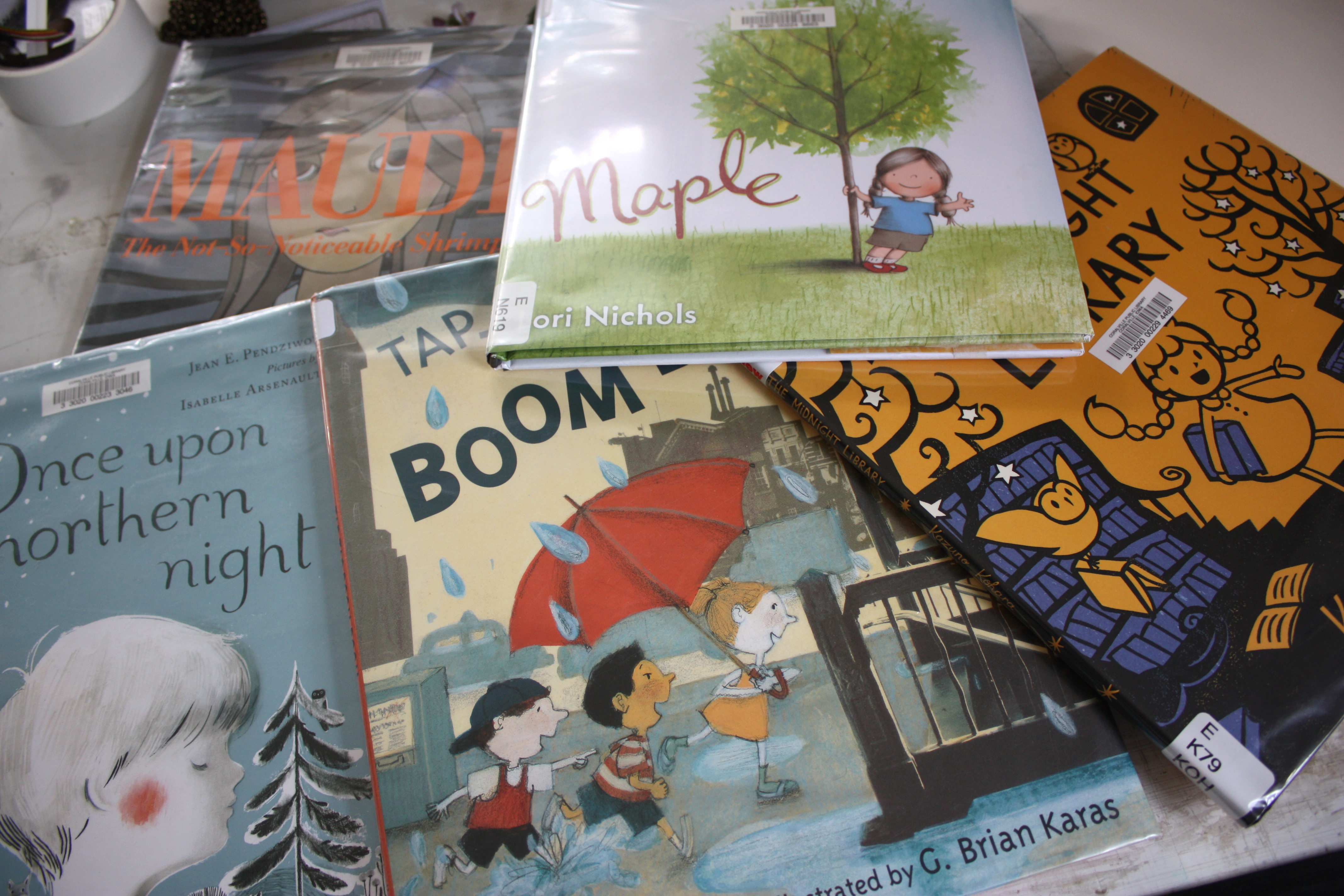
“Maple”, by Lori Nichols has a decidedly springy palette that echoes the tree growing and new birth. Contrast that with Kazuno Kohara’s Halloween-palette tale of “The Midnight Library”. And “Tap Tap Boom Boom”, illustrated by G. Brian Karas about a thunderstorm in the city, there are no sunny yellow colors here!
Next time you’re perusing a picture book, think about the color shifts that the artist uses and how they enhance the story. I think it’s probably something that most of us do subconsciously, or is it? I’d love to hear your thoughts below.
Thank you!
Thought-provoking post! I love how you suggest “think[ing] about the color shifts that the artist uses and how they enhance the story”. Thanks!
Thank you, Jill, glad you stopped by!
I love how the palette gives a book a feeling of cohesiveness.
Whoops! I hit return before TYPING OUT MY ENTIRE NAME, apparently.
I am a palette nerd, btw. 🙂 It’s so interesting to see how the chosen palette brings so much to a book.
Thanks, Tammi, it is fun to really think about the difference that color choice makes!
Color is in fact one of the most powerful ways to give a book or any visual sequential narrative immediately visible cohesion. Look for books with limited colour palettes that illustrate this meaning making feature. Then look for the patterned use of those colours and how the rhythm of those rendered colours adds another important source of cohesion to the text.
I never got the “new post” alert! Luckily, Jill told me it was up. Hopefully others got it (??). Anyway, this is so true. The palette conveys so much about a book (and as a reader, I often make snap judgments based on the colors on the cover). I love the examples you show!
Some weird glitch in our site caused the emails not to get sent to everyone this morning. To those few who might get it twice, I apologize!
Thank you Linda, it really was fun just to snap a picture of my pile and think about what the colors told.
Jennifer is awesome!
Suzanne is awesomer!
Yesterday I looked at THE IRRIDESCENCE OF BIRDS for the first time (by Patricia MacLachlan, illustrated by Hadley Hooper, Roaring Brook 2014), about Matisse, and was thinking about this very thing. It is a remarkable book on so many levels…. Hooper pointedly DOESN’T imitate Matisse’s palette — going for one that is much more muted and earthy. And yet he clearly builds on Matisses forms and lines. It is — along with MacLachlan’s brilliant, two sentence long text — really effective. (Another good one for your next haul!!)
(Oh whoops — Hadley is a “she”!)
Anna, thank you so much for the recomendation! I can’t wait to see it. That sounds like quite a challenge to imitate a famous artist, but not their palette. Can’t wait to see how she did it!
Sometimes, the color palette grabs me from my first glimpse at the cover, and at other times, I don’t give it a thought. I will, now. Thanks, Jennifer. 🙂
Jennifer, I missed the e-mail alert too. Great article on choosing color to set the mood in the story. I think some of my favorite PB use color to build the emotion of the book. “The Little Red Fish”, by Taeeun Yoo is one of my favorites. Can’t wait to see your new book!
Thank you, Jill and Dorothia! My post alert must have just fallen into some cyber abyss. Thank you, Dorothia for the recomendation and your excitement about the book!
Thank you for sharing, Jennifer! I can see how the palette choice helps set the tone in a book–or, at least, how it is an important part of helping the illustrations and the story fully convey the tone to the reader. And, after seeing your pile of library books, I’ve just added a few new books to my “must read” list 🙂