Fairy tales and folktales are favorites to many, and for some (myself included) they’re what made us fall in love with storytelling from a very young age. They’re often beautiful, haunting, mesmerizing; sometimes bizarre and confounding.
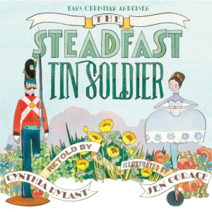 One of my favorites is Hans Christian Andersen’s “The Steadfast Tin Soldier”. The protagonist, a one legged toy soldier, is thrown into dire circumstances and must battle the fates, all for the steadfast love of a toy ballerina.
Because classic fairy tales are so well-loved, one would think them easy to remake. But, on the contrary, that is the reason that makes them hard to retell. They have been done over and over, and so the story and artwork must be approached with a few things in mind.
1) They must be uniquely told
2) They must be uniquely illustrated
3) The physical book itself needs to be designed and printed beautifully
The 2013 retelling by writer Cynthia Rylant and illustrator *Jen Corace, published by Abrams Books, hits these marks wonderfully.
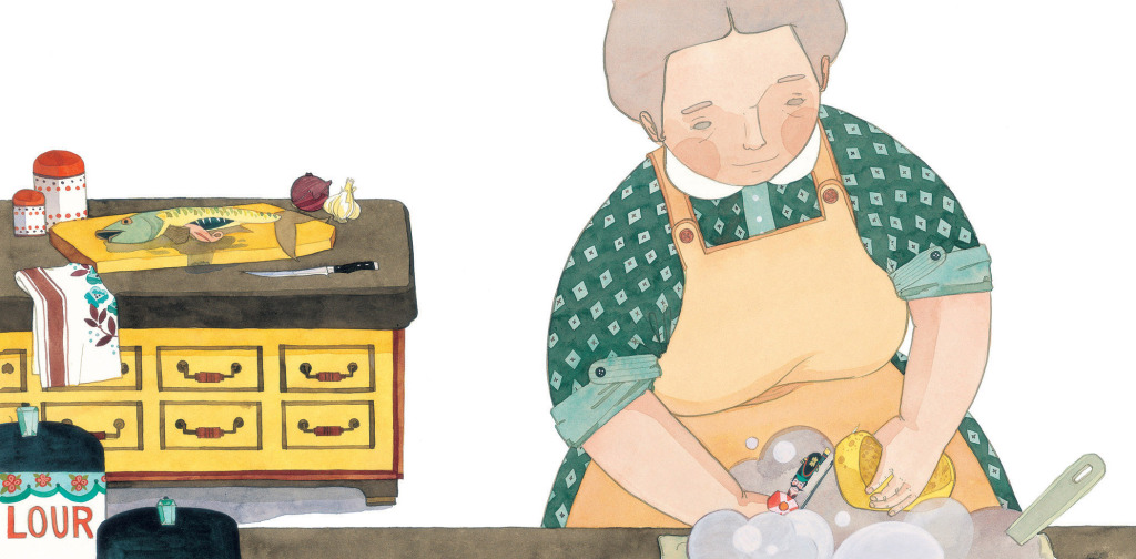
© Jen Corace
Uniquely told:
Cynthia Rylant has taken cues from the original in keeping the voice of the storyteller strong and present, which is a quality indicative of fairytales. But she also brings simplicity to the retelling, and pares the text down with thoughtful word choice, resulting in a smooth and lyrical read.
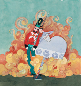
© Jen Corace
The issue of the tricky ending is, in this version, well-handled. Andersen’s original concludes with the Tin Soldier and Ballerina being thrown into a furnace. I usually see Andersen’s tragic endings as beautiful and fitting, and it’s a shame they are often changed. Two great examples are The Little Mermaid, and The Little Match Girl. Even though the endings are sad, there’s a sense of purpose and peace in them. With ‘The Steadfast Tin Soldier’ I have often wondered if Andersen was having a bad day at his writing desk, came to the ending and, with a little evil chuckle, decided to completely obliterate the characters. Whatever the case, Rylant allows them to be thrown into the furnace, but saves them in time for them to have fused together, never to be parted. This seems like an end for our steadfast Tin Soldier that he always deserved.
Uniquely illustrated:
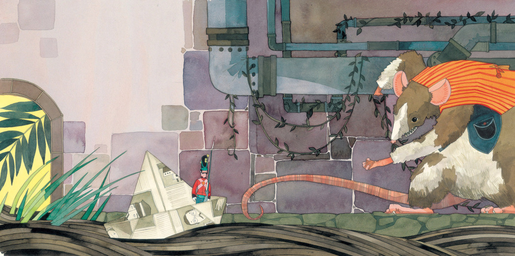
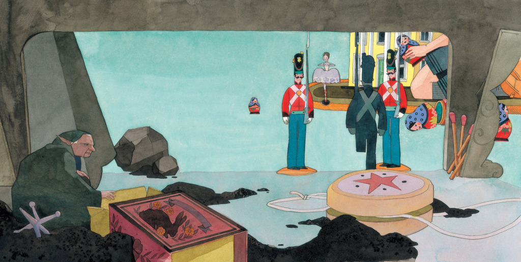
It’s Jen Corace’s artwork that makes this version stand on its own. Her paintings are modern yet warm, with retro and folk art touches. She balances unique with timeless, which is no small feat. She has an amazing sense of color theory, choosing hues of wide variety that are also somehow amazingly harmonious. This is a terribly difficult balance to strike that Jen pulls off with ease.
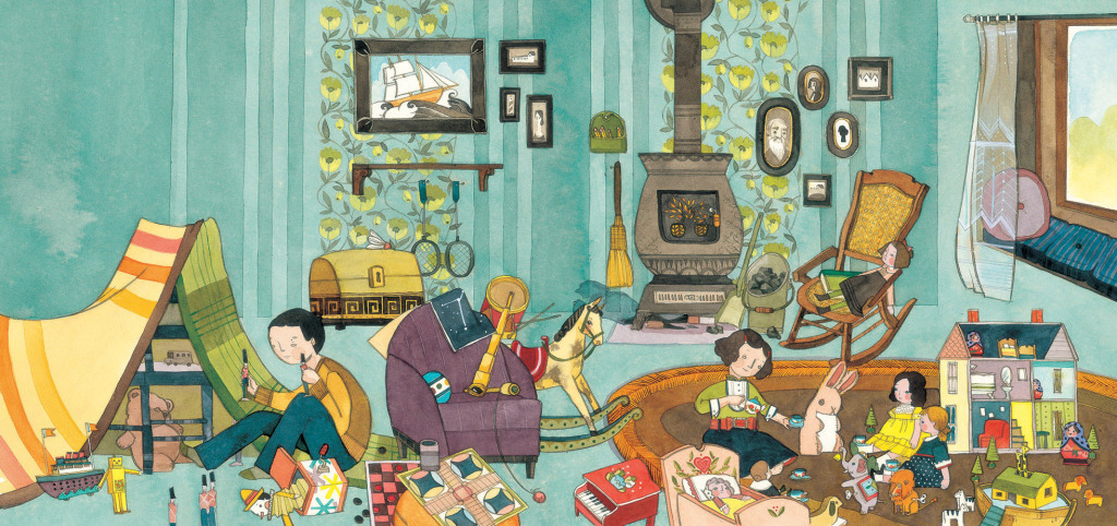
© Jen Corace
Jen uses interesting and unexpected angles, washes that are both textured and flat, a sense of depth in her compositions, open space paired with patterns and details – these are the things that keep me coming back to her work and thinking “How’d she come up with that?” All this adds up to what I love most about Corace’s illustrations (which perfectly echo the qualities of those classic fairytales); creative choices that defy the obvious.
© Jen Corace
Beautiful design and printing:
The type-layout, the endpapers, the hand-lettering, the paper choice — all the details on this book (designed by Chad Beckerman) make it a keepsake. If you look carefully, the back cover illustration cleverly mirrors the front, with the characters seen in shadow from behind, the lurking Goblin at their backs. Even the image on the dust-jacket is different from what lies on the hardcover underneath.
All of these carefully thought out choices add up to a unique and inspiring retelling of a classic tale.
© Jen Corace
*Images courtesy of Jen Corace. Visit her at: jencorace.com

I love these glimpses into the artist’s process, and I love Jen’s work (she did one of mine, too). I haven’t seen this one yet. Adding it to my list… Thanks, Eliza!
Thanks Jill! I love what Jen Corace did for ‘I Hatched!’ It’s so cool your work was paired up with her talent.
Gorgeous! And what a pairing of talents. Thanks, Eliza!
Such lovely artwork! And I like Rylant’s solution to the ending. Great post, Eliza.
Really interesting look into how challenging it is to make something fresh and different! Great job, thank you, Eliza!
I love, love, love those illustrations!
I have the same kind of fascination with HCA’s darker work. I love the alternative ending Cynthia Rylant came up with and I can’t wait to find and explore this book. Especially the wonderful illustrations.
This looks like a beautiful book! Thanks for posting about it, Eliza!
I’m loving this blog! Thanks for another interesting post!
Have you ever considered about including kacdkdcbededdcgk