Hello, Picture Book Builders people!
I’m in a critique group called PBJeebies. The members include Kim Norman, Janee Trasler, Jessica Young, and, well, me. Today, Janee stopped by Picture Book Builders to tell us allll about a recent master class that she participated in and learned a lot from courtesy of a very familiar author/illustrator pal of mine.
Welcome, Janee!
Thanks for letting me write a guest post, Tammi!
I don’t know about you all, but I always get a teensy bit jealous whenever anyone waxes lyrically about some amazing class or workshop they attended. Well, guess what? I took a master class in picture book illustration last year and it was…you guessed it…AMAZING!
Troy Cummings was the instructor. The class was online, self-paced, and best of all (get ready, this is not a typo), it was free.
Before you Google to find out where you can sign up for the Cummings’ School of Picture Book Illustration, I must confess Troy didn’t even know he was teaching it. One of the fun things I like to do in my spare time is make promotional materials for my pal Tammi’s new books. When NOT NOW, COW was due to come out, I decided to challenge myself by dusting off some animation skills to make a series of teaser trailers. This is where the master class began.
Lesson 1: Details
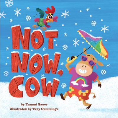
In the book, Cow can’t quite get the hang of the dressing for the seasons. I loved how Troy illustrated the exact same scene/setting each time and just changed the details. He also used this technique on the title pages for each season. Where we see the limbs of a tree and how they change with the weather. These details are plentiful and will give the reader/listener new things to discover with each reading. Very effective.

Lesson 2: Texture
Because I needed to separate Cow from the backgrounds to use in the animations, I had to fill in the holes left behind. This is where I noticed the amazing variety of textures and brush strokes Troy uses in his work.

One of my biggest struggles as an illustrator is loosening up and breaking my own self-imposed rules. I tend to pick two or three brushes and stick with them throughout a book or project. Trust me, to replicate Troy’s textures on these animations, I had to pull out every digital brush I could find. I loved the sense of freedom it gave me. Excellent exercise!
Lesson 3: Spot Illustration
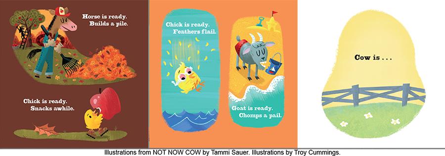
I love when illustrators break up the layouts of full-page or full-spread images with a few well-placed spot illustrations or vignettes. Having read the NOT NOW, COW manuscript long before the illustrations were added, I was so pleased to see how Troy used spot illustrations to pace this book. They help the reader (and listener) find exactly the right rhythm. One great example of Troy’s excellent sense of timing with the spot illustrations is how he used them to get just the right sense of tension each time Tammi’s text teases us about Cow’s next outrageous outfit.
I have paid hundreds of dollars for workshops and classes before and walked away without learning half of what I learned from this self-styled master class. Thanks, Troy!
Want to try it yourself? Just find a book with images you love and do a deep-dive study of what that illustrator did. Like the compositions? Make thumbnails of the book so you see how the illustrations are put together. Enamored with the color scheme? Try experimenting with a similar palette on a test illustration. Love the way the character’s expression changed? Practice sketching your own character with a range of emotions.
You’ll learn new skills, add new tools to your toolbox, and gain a whole new level of appreciation for a fellow illustrator’s work. And it’s free!
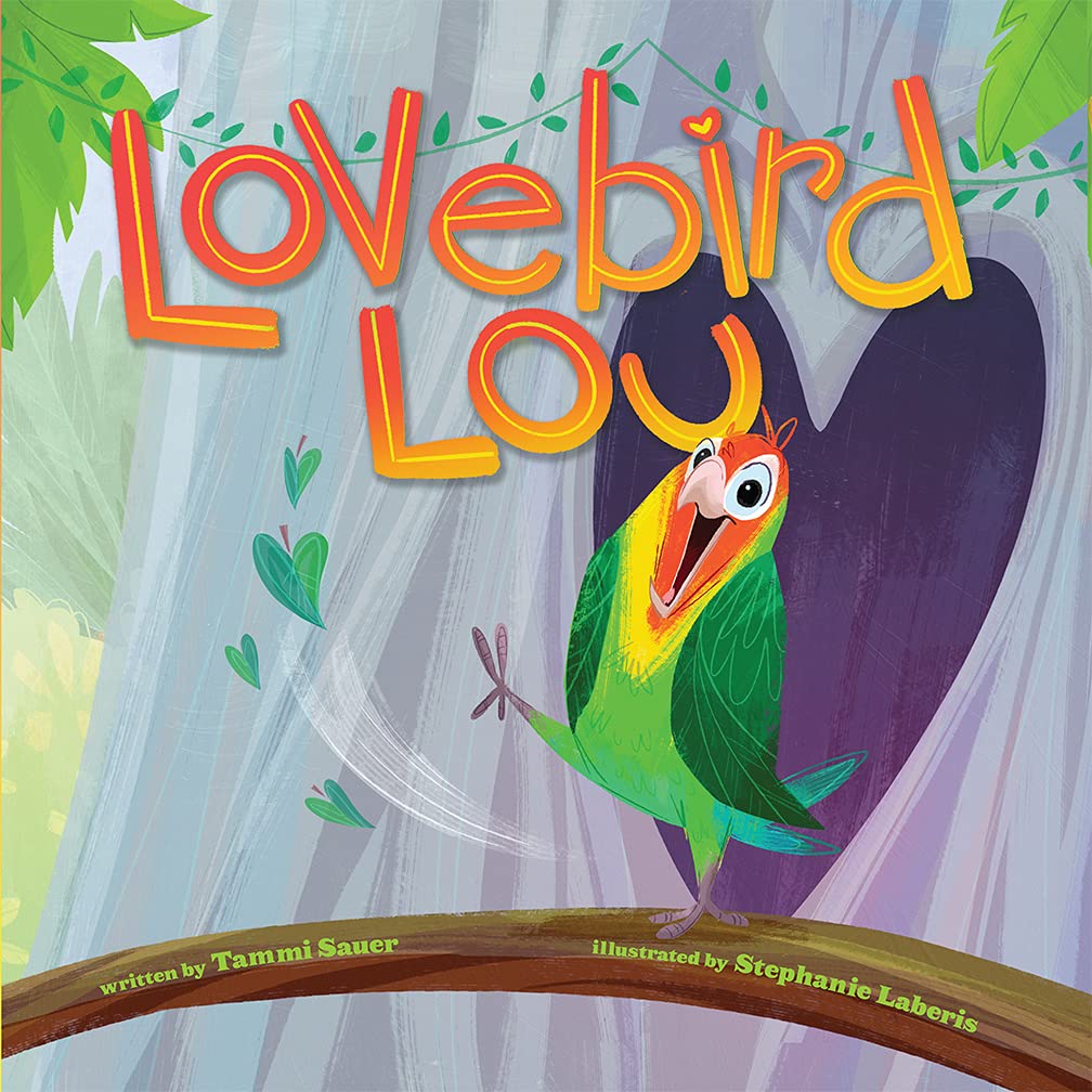
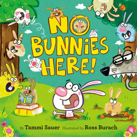
P.S. I have since taken self-styled master classes from Stephanie Laberis (LOVEBIRD LOU) and Ross Burach (NO BUNNIES HERE!).
Thanks, Janee!
Picture Book Builders people, if you would like to see the teaser trailers Janee created for NOT NOW, COW, the countdown and valentines she created for LOVEBIRD LOU, and the mini-movie she created for NO BUNNIES HERE!, please visit my Instagram (tammisauer) and scroll around. I am such a lucky duck!
BIO:
Janee Trasler is the author/illustrator of many books for children, including her latest series FROG AND DOG from Scholastic Acorn and her upcoming FIGGY & BOONE series from Simon & Schuster’s Ready-to-Read Graphics. The 2020 winner of the National Cartoonist Society’s award for best book illustration, she splits her work time between her small-town Texas home office and her even-smaller-town Texas studio. You can visit her on the web at http://www.trasler.com.
WINNER:

Congratulations, Terry Jacobsen. You won a copy of No Bunnies Here!

I love animal stories and who could resist another cow story? All praises for Tammi Sauer who keeps giving us all these fun books for children to read. I wonder what kind of story Cow will give us this time.
Fantastic! I have checked out a bunch of Tammi’s PBs and it was indeed a master class studying them–so fun.
Thank you for breaking down the study of illustration for us. As a non-illustrator, I found it fascinating! I love your art, Janee, so full of bright colors and wonderfully expressive! Great interview, Tammi!
Thanks Judy!
Love this! I especially love how Troy showed the same tree in the different seasons. Thanks for the post!
He’s brilliant.
Awesome! Love the break down. Thanks!
Thanks, Angie!
Love it! Thank you for this interesting and informative post! I enjoyed seeing the examples!
Great information! Thanks for sharing. I have logged this back in my brain to try at a later date, and bookmarked this too : ).
Love this idea! We can learn so much by studying books we admire. You put a really fun twist on this here!
Thanks, Cynthia!
I totally get it, Janee! I make graphics for friend’s book birthdays and also go over many details, examining each spread very closely, including all the elements you mention in your post. Such a treat to learn almost by accident!
Exactly, Julie!
Love this idea! I have heard the same thing from other illustrator workshops — another great exercise is to take a classic story and reimagine it “in your style.” You could even start small; for example, just take on a cover first, maybe “Heidi” or any other story like that. Heck, Winnie the Pooh is now out of copyright, so you could even give that a go! What would your Eyeore look like?
Good idea, Elayne.
Thank you, Janee! What a wonderful explanation of Troy’s amazing work. I admire illustrators and their talent. They’re magical!
Such a great post!…I had the pleasure of meeting Troy at a book signing in Indianapolis years ago. Such a darling! That’s why he and Tammi make a great pair.
Very interesting…even for a non-illustrator. I just love hearing about artistic process.
Love comparing these styles! Bravo!