When in doubt, ask a librarian.
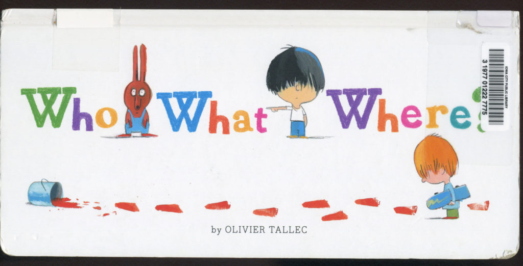
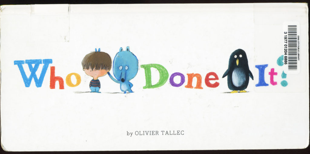
I was chatting with my librarian friend, Sara, and asking about book shapes. I’m at that beginning stage with my next picture book and I wanted her thoughts on how different shapes work on the shelf. Sara mentioned that small books often get pushed back into the shelf and their spines don’t show making them hard to find and perhaps getting lost entirely on the shelf. Then she said that an exception might be “Who What Where” the new companion book to “Who Done It” by Olivier Tallec.

(Please forgive my scans of the actual library books. I could not find any higher res. images on the web)
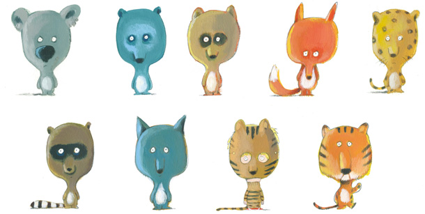
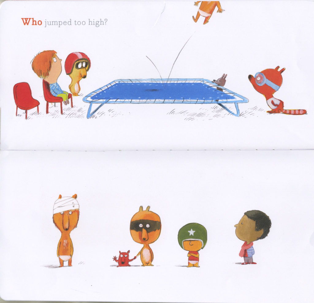
Both of these books have the same, innovative, interesting shape. They are long and skinny with a very hard board book cover and well enforced pages. The book size is 5 1/2 inches by 11 1/2 inches. It opens with the spine at the top, i.e. very horizontal. Both books ask “Who” questions. Such as “Who got stuck in the tree trunk?”, “Who got a little too crazy jumping on the bed?”. For me, this creative layout works even better in this second book,”Who What Where?”. In this book, Olivier Tallec uses the top page as the action page and the query page. The page underneath has a lineup of ‘suspects’ from which to choose. In his first book, “Who Done It?” the question appears at the top. For instance “Who didn’t get enough sleep?” and both pages are filled with a cast of characters. Some shrewd detective skills are needed to solve the puzzles in both books. Children (and adults— some of these were quite tricky!) must really study the details of each character. They need to compare both emotional facial expressions and physical attributes to find the answer.

At the back of each book are the answers. I think this would be really interesting to share with a story time, or with a classroom and notice how various ages use their power of observation differently. The only toughie is that you really need to be able to see the illustrations cleary and closely.
Kids would have a wonderful time coming up with their own illustrated mysteries. What Olivier Tallec has accomplished embodies what we, as illustrators do every time we develop a character. We give that individual visual cues that tell the reader even more about him or her. Their likes and dislikes. Is the little girl wearing a sport team tee shirt or lacy frills? Does the little boy hide under a cap, or have a purple mohawk?
I absolutely adore these two skinny books. I know I would have loved them as a kid and I think they have a lot of ‘go back to again’ appeal and would be wonderful to entertain a child when traveling or sitting in a waiting room.
Not only is the design of the book clever, the concept engaging, but the illustrations are absolutely stunning. Each character exudes so much personality and quirkiness.
If you haven’t seen these books already give them a peek and test your detective skills! Happy sleuthing!

~~~~~~~~~~~~~~~~~~~~~~~~~~~~~~~~~~~~~~~~~~~~~~~~~~~~~~~~~~~~~~~~~
THE WINNER OF THE BOOK GIVEAWAY for My Busy Green Garden is SHARON HAAN!
Sharon, please contact author Terry Pierce at terry@terrypiercebooks.com
Thank you!!!

Thanks for sharing this post. Can’t wait to check out these books!
Hope you enjoy them, Katrina! Thanks so much for visiting today!!!
What a clever, visual concept! I’ll have to look for these books by Tallec. Thanks for sharing!
Thanks, Julie— hope you like them. They’re a lot of fun!
I didn’t realize there was a second one. They are so clever! Thanks!
It just came out, Mary. I think the fact that it shows the ‘scene’ of the action is a neat twist!
I’m writing down these titles! They look intriguing and adorable.
Thanks, Jill! They’re very amusing 🙂
I love books that make kids think and improve their observation skills. Thanks for sharing!
Thank you Kathy! There were honestly a few that I really was unsure about. Lots of fun!
I love WHO DONE IT? So happy to hear about the companion book. And how interesting to have that conversation about book shapes with your librarian friend. I hadn’t thought a whole lot about it, but it really makes a difference (and it’s so true about small books getting lost).
Hi Linda, I was wondering about a tall, skinny book not fitting on the shelf which is how our conversation began. I hadn’t specifically thought about the ‘little book problem’ before either and thought it was interesting.
Skinny books feel like the secret message of a card or a letter must be inside. Thanks for this post.
What a wonderful observation, Deslie! Thanks!
Very good point how we as illustrators do the same thing. And what a great idea, to ask a Librarian how different sizes get treated on the shelf! Thank you! I look forward to checking these out. 🙂
Thanks for visiting and commenting, Kathy!
Publishers of oversized books or tiny books clearly don’t have libraries in mind when they design them. Oversized don’t fit and as you mentioned, the extra small books get lost. Books with unusual shapes pose another problem–rounded corners or uneven edges often don’t allow a book to stand up straight on the shelf.
These are all excellent points, Lauri. As we all know from our own ‘libraries’ at home, too. There are always those books that have to lay sideways… Thanks for your comment!
This is brilliant. But yeah, the whole unusual size things may work against you in libraries and retail.
Thanks, Kevan! Sara did mention that with this particular book, because it’s so thick and sturdy, it’s often one that stands well as display atop the stack of shelves. So… ?
How fun!
It is! They are! Thanks for stopping by, Terri!
I’m going to look these up this week, thank you!
Hope you like them, Kristin!
Can’t wait to check out this unique book.
Hi Patricia, I certainly can understand that! Thanks for taking the time to visit and comment!
Hi Suzanne, hope you like it/them!
I’m familiar with “Who Done It” and it’s a fun book. But I have to say that when I worked in the public library, it was a bit difficult to display.
I loved the first book, can’t wait to see the new one. Thanks for the heads up!
Sure thing, Susan! Thanks so much!
Cute visuals. The layouts really add something nice to them. But as Patricia said, it must have been a bit hard to display. Still, I love design over logistics (depending on the situation, of course) because I’m a page designer. Lol.
Thank you, Jackie! Glad you visited Picture Book Builders and thanks for taking the time to comment!
This looks so cute, Jennifer, thank you for sharing it! This makes me think that I would love to illustrate a book with a really exaggerated format at some point.
Hi Eliza, if and when you do it will be beautiful!
Thanks for telling us about these little gems!