
Personification is the commonly used literary device of attaching human traits and characteristics to animals or inanimate objects. I think of personification similar to the way we think about rhyming – tricky to do well, but so wonderful when it works. Since everyday objects are not often seen as sentient or emotional, some personification can be unconvincing and forced, leaving us feeling disconnected and unsympathetic towards the character or situation.
Some personified characters are easier than other to create. Human qualities transfer easily to animals, and even inanimate objects can be given hands and feet, as in “The Day the Crayons Quit” by Drew Daywalt and Oliver Jeffers.
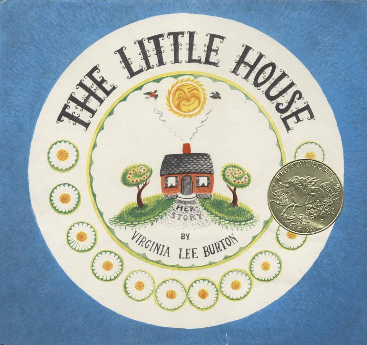
My all-time favorite use of personification in a picture-book is “The Little House”, the 1942 classic by Virginia Lee Burton. The book follows the story of a House that lives in the countryside. As the years go by, the country transforms as the city gets closer and closer. The Little House is eventually abandoned and slowly enveloped by cars, trains, people, and buildings.
Virginia Lee creates successful personification through the use of composition, repetition, and visual human traits.
COMPOSITION: On the first single page we’re introduced to the Little House, placed in the center of the composition (showing that she’s the center of her world), which establishes her as the hero of the story. The first full spread zooms out, and she’s placed on the lower right side. She sits above the horizon line, suggesting that she’s the one still in control of her world. “Day followed day, each one a little different from the one before . . . but the Little House stayed just the same.” Our focus is all on her.
In the spreads that follow, the background is revealed around her – a peaceful countryside during every time of the day and every season of the year. But the horizon line rises above her, and with it our focus shifts to what’s happening in the scenery around her.
REPETITION: The themes established in the beginning–seasons, time of day, activities of the owners and neighbors–are repeated from beginning to end, and used to compare what used to be with what has become. From the first full spread to the ending, Burton uses the same exact page layout and view of the house throughout the entire book. This is an important choice for this particular story because our main character is rooted in one place as the world changes around her. We’re sympathetic because she can’t move (therefore our view of her also doesn’t move). Each pleasure in her life is slowly taken away; the fields, gardens, trees, her owners. By the end she’s so surrounded that even the sun is blocked by the towering buildings. Children, who especially grow attached to places and belongings, can relate to the comfort and security that’s been lost.
VISUAL CHARACTER TRAITS: Burton uses the existing pieces of the house to act as a face. At first, two curtained windows create soft eyes, and the front steps are gently curved into a smile. It’s subtle enough that it may take a second reading before the reader notices that the face is there. The steps eventually curve down into a frown, the curtained frames are replaced with broken panes; the cracks create pupils placed at the top of the frame, giving her droopy sad eyes. Her door is boarded up, and the city towers around her.
In the end, when she is picked off her foundation and moved, the repetition is broken. The Little House is restored to her original view from the first single page; slightly zoomed in and placed again securely above the horizon line with only sky above her. Her curtained eyes are restored, and the steps returned to an upright, slightly larger, smile. By sharing her experiences we’ve nearly forgotten that she’s an inanimate object — she’s become so alive that we feel as she feels. Her joy and pain is shared, and her peace becomes our own.
~~~~~~~~~~~~~~~~~~~~~~~~~~~~~~~~~~~~~~
P.S. Nonfiction author extraordinaire Barb Rosenstock bids all a fond farewell as she leaves our blog to fully concentrate on her writing. Fortunately, prolific nonfiction author Suzanne Slade has agreed to join our picture-book-crazy group. We’re excited to have her! Look for Suzanne’s first post on January 27th. Meanwhile, you can see the covers of a few of her books on the Our Latest Books page, and read more about her on the Who We Are page. Happy holidays!
Well done. I’ve read this one years ago. Time to reread it. I have a work-in-progress that relies on several settings. This will guide my way! Thank you!
Thank you Eliza. You did a great job of breaking down each element and explaining why we connect emotionally with the Little House.
We read VLB’s MIKE MULLIGAN & HIS STEAM SHOVEL a zillion times when my son was small, but somehow I’ve never read this one. It sounds so charming and poignant–I’m going to pick it up at the library. Thanks, Eliza, and happy holidays!
Thanks for this post and thanks for using one of my all-time favorite picture books.
Personification of inanimate objects seems hard to me. I love that you gave us such a great example and detailed explanation. I’ve put The Little House on hold at my library and can’t wait to study it.
I finally read The Little House just last year, and it touched me deeply. I FELT for the poor little thing. Thanks for showing us how she managed that, Eliza. I too rarely stop and think about the art tricks you all employ to add depth to a book.
I adore Ginny Burton’s work – and if anyone ever comes to Boston/Gloucester area, I’d love to bring you to the Cape Ann Museum where you can see the mock-up for The Little House and the Acorn press used by the Folly Cove designers. Last year I wrote a blog post about it: http://bit.ly/1sSmvc8
I love this post. And I’m compelled often to personify inanimate objects while sketching. I even have a story about an personified piece of furniture in my files. I pull it out and play with it every few months. The story is incomplete, but I love sketching the character…
I have a vague memory of Burton’s book and will go search it out!
Thank you, Eliza! After the wonderful advice you gave attendees at Illinois-SCBWI’s fall conference, it’s nice to know that we can continue to learn from you here.
Oh my goodness, so grateful to Patricia Toht for posting a link to this site! What a goldmine of wisdom and inspiration. Geez, really happy to see these discussions! What a great post, Eliza!
There is a cartoon that I loved growing up that I think was based on this book, I think. Such a good illustration of personification!
I just checked this out from my e-library, and it’s a heartwarming book! Thanks for pointing out the personification and pb tips!