Okay, sorry writers, this is really illustration-oriented.
My illustrations have been called cartoon-like in the past, and I’m fine with that. In the most basic sense, my illustrations seem to be black lines with color fills. Which can be, well…cartoon-like. The second to the last book I did (Swamp Gas) was an experiment in a new technique for me—no lines. I enjoyed doing it, it was a different look for my style, but it still seemed cartoon-like. Not the there is anything wrong with that! And they looked good. It was just a lot more stressful.
Many illustrators work in this way—line and color and/or texture fills. And in viewing their work, I tend to get “line envy.” That is, I marvel at quality of other artists’ line and wish I could replicate it. Granted, I’m primarily digital, and most of the line I gush over is using traditional medias, still….
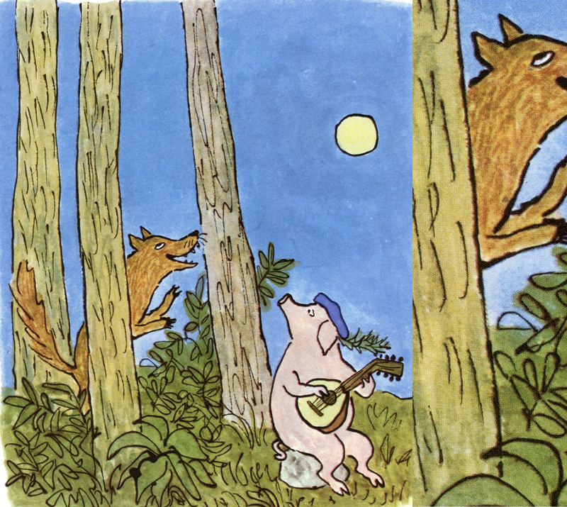
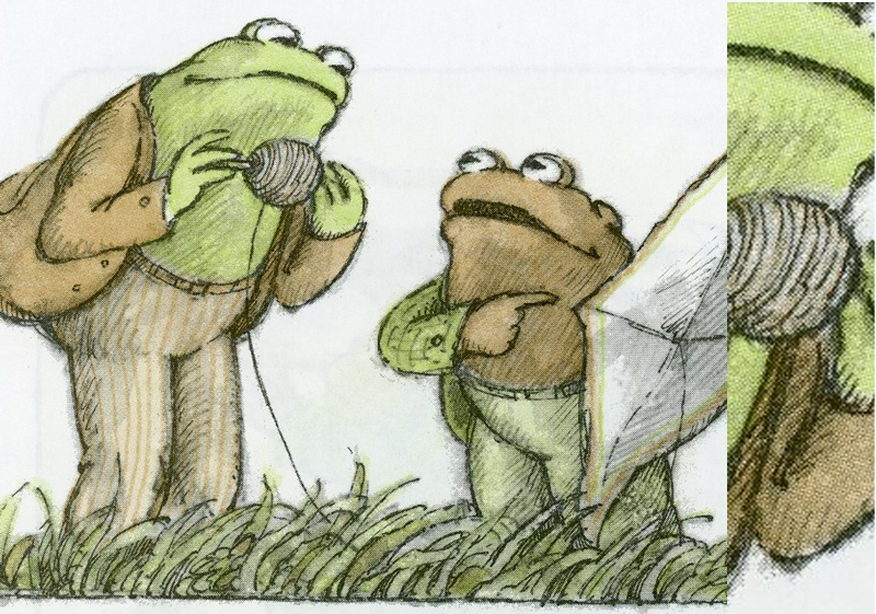
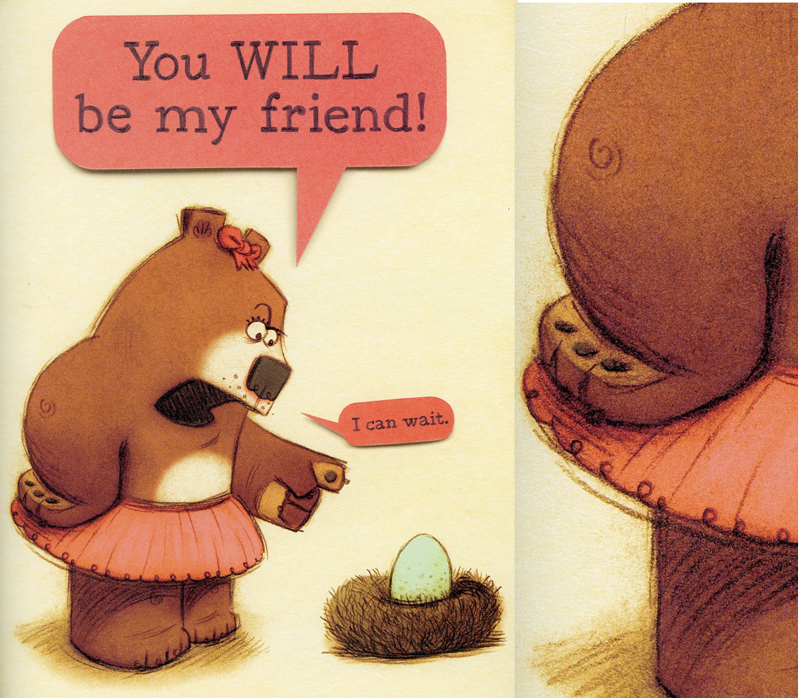
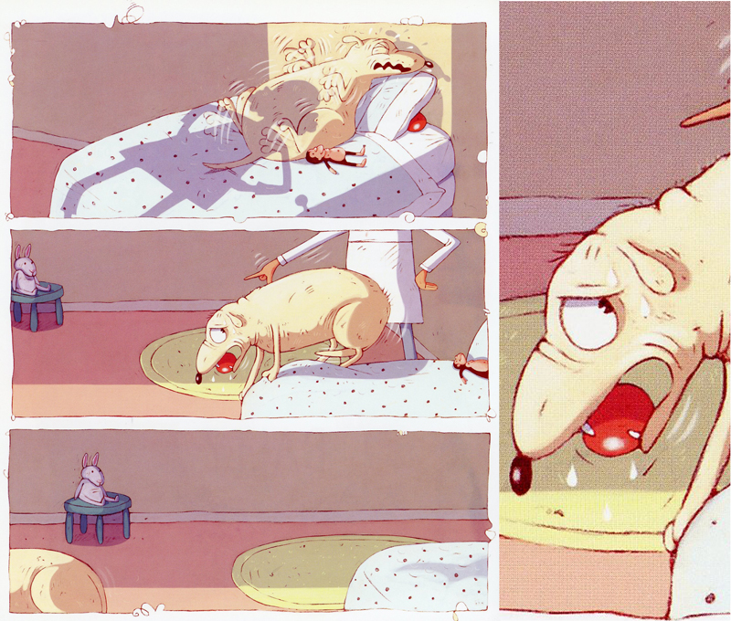
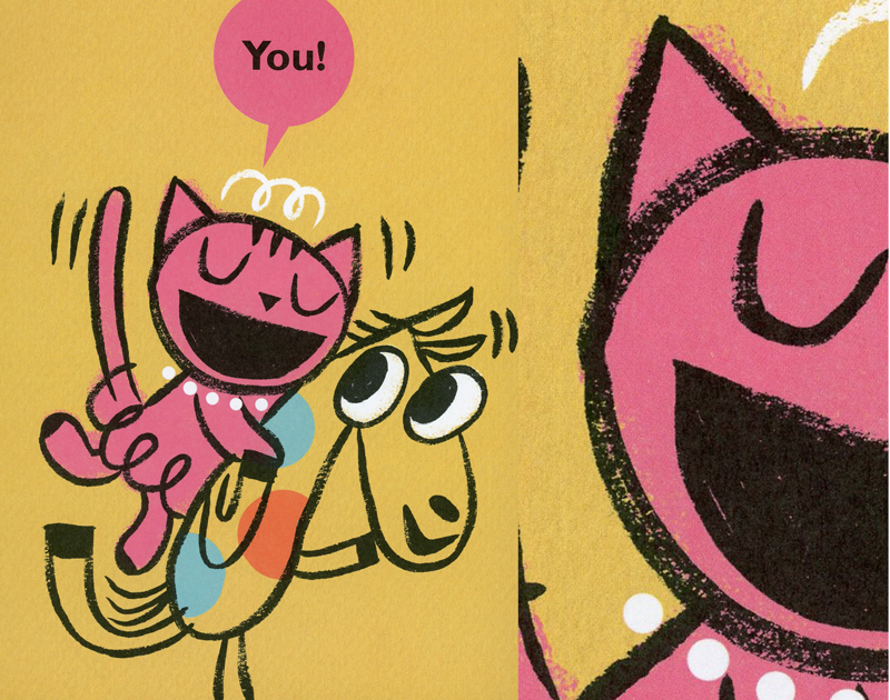
I’m including just a few samples of the kind of line work that makes me salivate. On each sample there is a close up on the right side of the drawing to see the line a little better.
William Steig’s line work is wonderfully rough. Probably a crow quill.
Arnold Lobel’s sketchy line and lightly erased pencil kind of speaks to the era it was created.
Peter Brown switches it up between his books. The style he used here is also very sketchy. I love the looseness and non-committal pencil line work.
Rainbow Watkins also has very rough pencil sketches he paints within—or maybe adds the pencil after the paint??—always trying to figure it out.
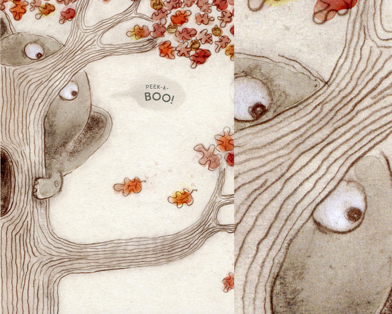
Jennifer K. Mann’s work….I’ve drooled over her line work for years. And I’ve seen it in all stages. Just gorgeous.
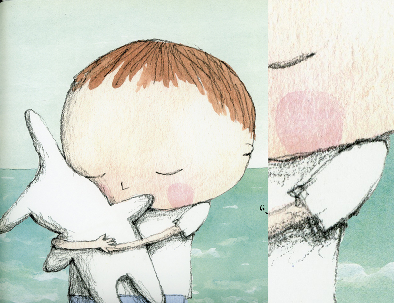
Wendy Wahman, who up till recently was a lineless illustrator for her books has tackled line in her new Nanny Paws. She told me she works small with just a number 2 pencil and enlarges it in Photoshop. It is so rich and interesting.
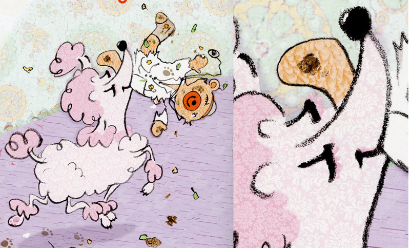
Mary Sullivan has a light touch with her line work, pencil on drawing paper. She gives it an even lighter touch by coloring it a deep sienna.
Bob Shea has a simple, loose line quality in Ballet Cat that it looks totally effortless, though I am sure it is not. Brushy…
I think Kate Berube uses ink for her line work here. I love how fluid it looks and the varying opacity.
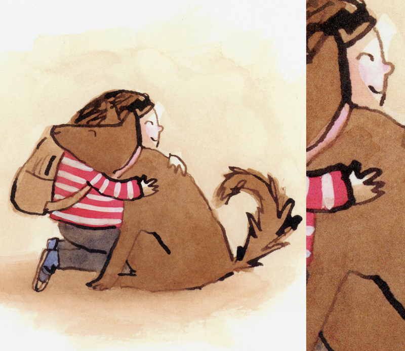
The looseness and almost carelessness of Dana Sullivan’s line work has always baffled me in its delivery. Another one that looks easier than I’m sure it is. Even though I know he is a fast artist.
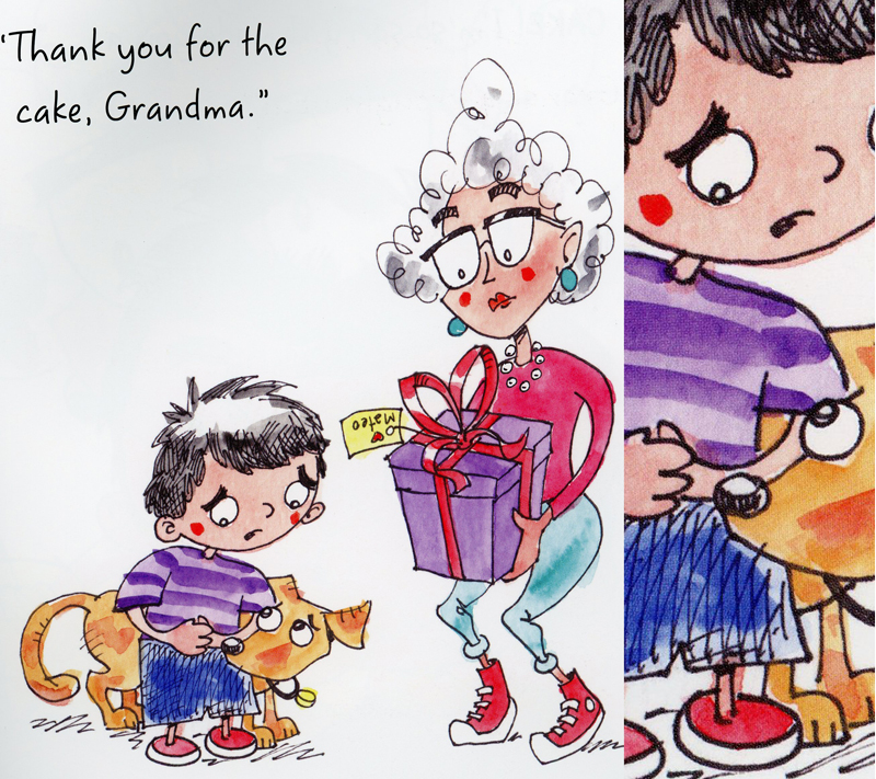
Matt Davies inkline in his illustrations is loose and tiny and scribbly and magic. Can’t say enough about this!
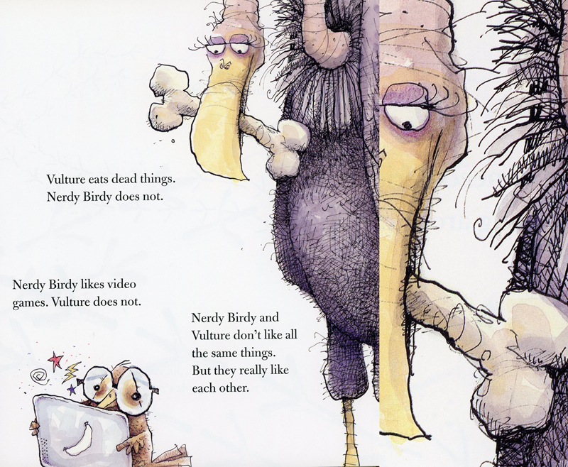
Jesse Joshua Watson is a little different style than what I’m discussing here but I love his line work. They are so thick yet so detailed.
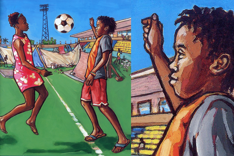
Laura Kvasnosky showed he how she gets her wonderful line work once. I’ve tried it myself with poor results. I marvel at what she does here.
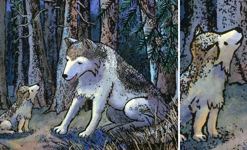
I love the simple line work of Zachariah OHora’s work here. His decision of when and where to use line amazes me. This must all be done with brush.
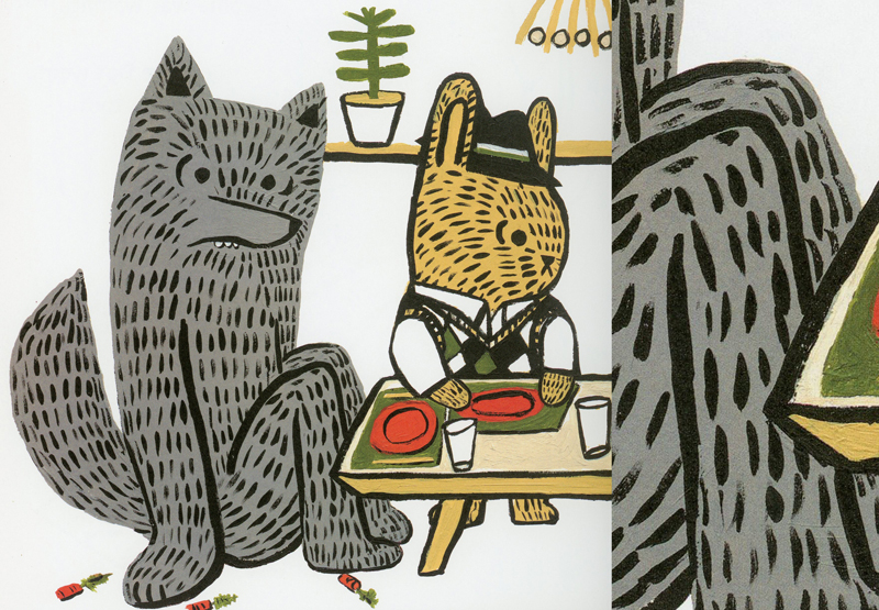
A little more ‘cartoony’ is Tim Miller’s work in Snapsy the Alligator. Though it looks like simple line work, its variation in weight and flow is terrific.
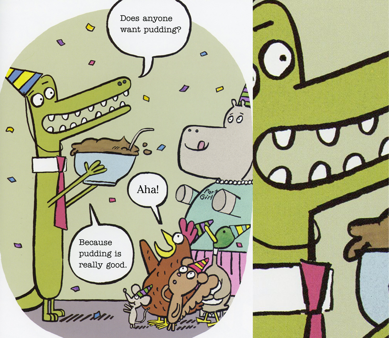
Finally, I’m going to stop here with Sara Varon, who I adore everything she has done. Her line work is similar to Miller’s above, but it is more clean and fluid. The nonchalance of them is enviable. I don’t know if she works with ink or brush or digitally for these lines, but it doesn’t matter, right?
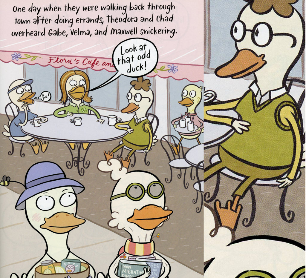
I had a ton more other examples to show but I realize that what I find fascinating may not always be for others. Anyway, thanks for looking!

This is fascinating for writers too! Thanks so much!
I’m always fascinated by artists’ techniques and I’m not an artist. Keep these posts coming!
Wow! I loved this post. Illustrations in children’s books fascinate me.
There is so much to art work that we, as writers, take for granted. Thanks so much for this little tutorial on lines. I’m going to pay a lot more attention. I found your article really interesting and informative.
I look at the same stuff, Kevan! one reason why I will be missing John Burningham – thank goodness he was so prolific!
Cool! Love this post!
I’ll never look at lines the same again. I took a lot of this for granted. All the variations are wonderful.
Thank you.
Love this.
I learned a lot about illustration. Thanks Jill.
Thank you for this–a perfectly timely post with sensational examples–much appreciated!
This was so interesting! Love all the examples, Kevan!
Great post, Kevan! I’m always interested to know whether an artist does their line-work first or second. I used to do mine first, but I have found that painting first lets me decide where to omit lines and keep things a little looser (which I like). Very interesting, thank you!
I have a totally new appreciation for lines! Thanks!