This was a dangerous topic for me. I knew I’d likely tumble down a rabbit hole, all too happy to stay there. Join me in the rabbit hole to admire a legion of unsung heroes of illustration. Most of the books I’m about to share did name those illustrators. Tsk-tsk to McGraw-Hill, circa 1960, who did not think it necessary.
As much as I love picture book illustration – especially Midcentury style — there’s another place to revel in the work of excellent, prolific illustrators: textbooks and songbooks. I often rescue these from the Goodwill Outlet, “where Goodwill items go to die.” Right now, I’m especially glad to have rescues scattered around my house because I’m back to working on my illustration skills. Here are a few in my collection…
BASIC GOALS IN SPELLING
McGraw-Hill, 1960
No illustrator credit. (Sigh.)
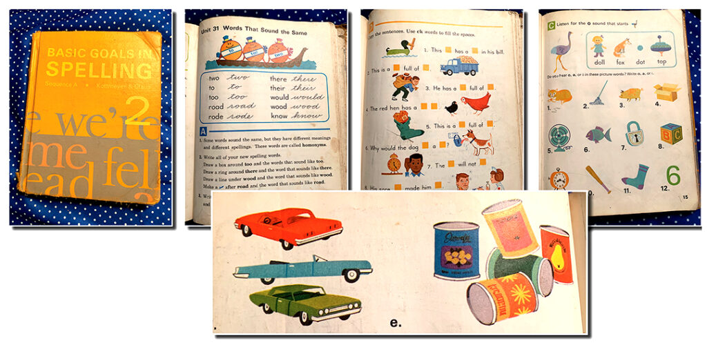
As a nerdy, former spelling book (and spelling list) lover, I know I would have adored this book. And as a long-time graphic artist, I also admire a designer who knows how to arrange a page with a lot of elements. I’m only sorry I don’t know who drew hundreds and hundreds of cheerful images. Whoever they are, I award bonus points for the cool cars.
SPELL CORRECTLY
Silver Burdett Company, 1977
Edward Malsberg, illustrator
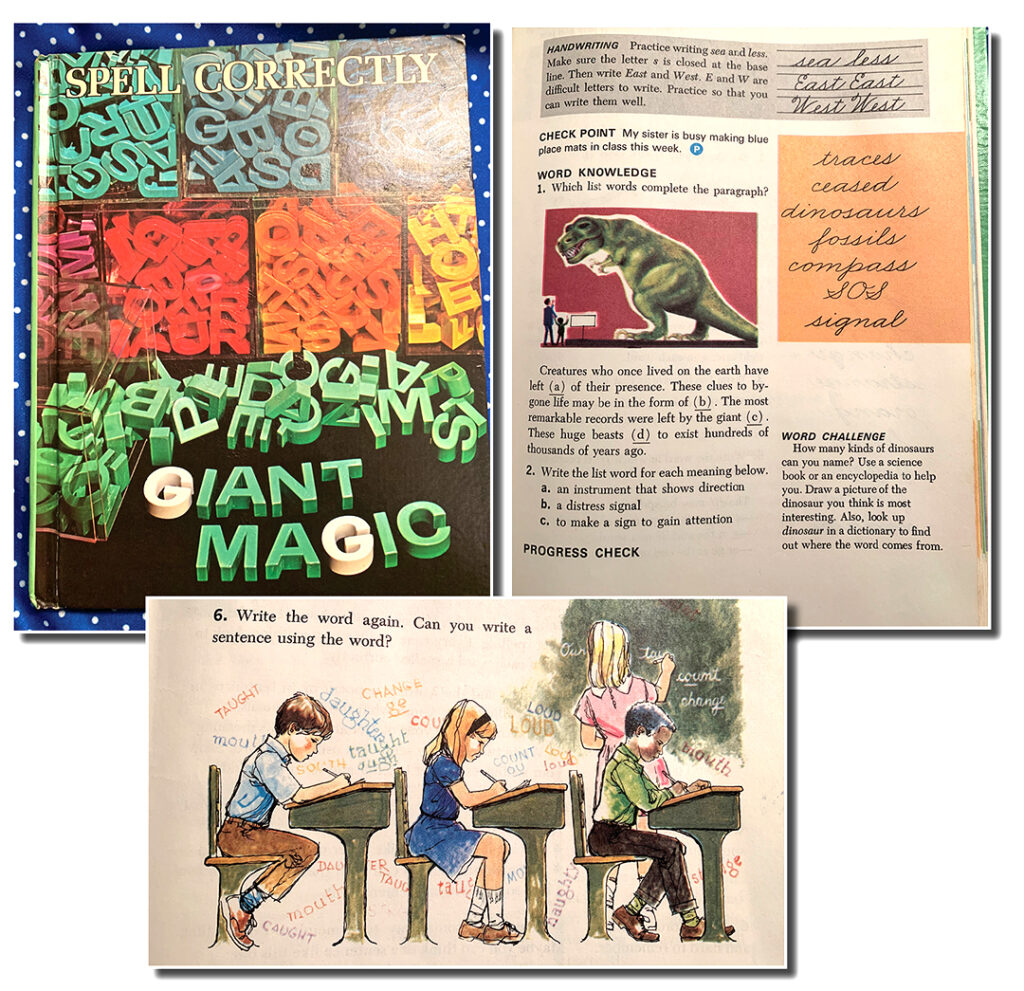
Another well-laid-out spelling book with nice line art and paint washes. I always loved a book with cursive text elegantly adorning the composition. This book, published in 1977, is more recent than many in my collection. It’s a shame children of color had to wait so long to see themselves in the pages of their textbooks. It’s my most common complaint about books that are pleasing in many other ways.
Something else caught my eye in this book. I was surprised to see this technique hanging on into the late 70s: See that white halo around the dinosaur? As a graphic artist old enough to remember color overlays and registration marks stuck on with tape, I remember the struggle to make sure each ink plate lined up with the color below. One trick common to the overlay era was allowing “air” around an image so the chalky background could be hastily applied without worrying it would land off-register. I know the practical reason for it, but I still think it looks cool.
FROM EIGHT TO NINE
Scott, Foresman and Company, 1962
Ati Forberg, illustrator
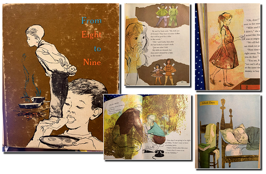
I always enjoy the results of an unruly dipped pen, so I adore the blotchy lines and luscious textures in this book. It’s an exciting standout in my collection. Lots of deliberately (and delightfully) off-register illustrations, as well as inks that casually spill over the line work as they do on the sleeping boy’s arm, lower right. Nothing but a sepia splash on the girl’s shoes, upper right. Mr. Forberg didn’t even TRY to line up the background behind the paper dolls… and I can’t get enough of it! I also love the subdued colors that allow the line art to anchor each scene.
THE RAINBOW DICTIONARY FOR YOUNG READERS
World Publishing, 1947 (new cover 1972?)
Joseph Low, illustrator

Joseph Low, who died in 2007 at the age of 95, was a remarkably prolific artist. The thing I can’t figure out about this book is that the cover of this 1972 edition doesn’t seem to match the far superior interior artwork which – based on the cars – is obviously unchanged since the 1947 edition. The ’47 images have the Midcentury vitality I love. The cover has none of it, and yet another artist is not credited. So I can’t tell if they short-sightedly tried to wedge Mr. Low into a more “modern” style that doesn’t hold up as well as Midcentury, or whether a different artist was commissioned for a new cover. Either way, check out the link below to revel in more of Low’s exciting work:
http://www.letterology.com/2014/01/the-rebus-riddle-rhymes-of-mother-goose.html
HEALTH TRAILS
Laidlaw Brothers, 1957
Milo Winter, illustrator
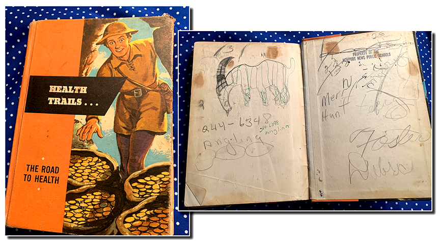
I confess I was uninspired by Mr. Winters illustrations in HEALTH TRAILS, but sometimes the treat in an old textbook is the STUDENT artwork! I also love ephemera like stickers that list years, classrooms, teachers and student names.
TOM GLAZER’S TREASURY OF FOLK SONGS
Grosset & Dunlap, 1964
Art Seiden, illustrator
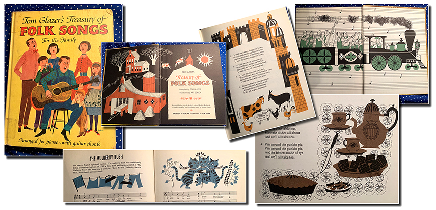
I’ve saved the best for last, because I’m a HUGE Art Seiden fan. There seems to be little known about his personal life, but his work is immortalized in more than 300 books! Scroll through miles and miles of his marvelous covers and illustrations here: https://fishinkblog.com/2017/07/10/art-seiden-mid-century-illustrator-of-childrens-books/
Do you have a favorite illustrator you’d like to recommend I study? Doesn’t have to be Midcentury. I’m also a HUGE fan of collage illustrators, digital or analog,so if you know of any (even if it’s YOU!), please tell me about them in the comments below.
Now to some very late news. Because I swapped with another contributor in May and didn’t post in June, I’m also late announcing the winner of the decoupaged train case I promised in my April post. Vijaya Bodach won the drawing for the as-yet-to-be repurposed train case. She has promised to send me a photo once it’s in use in her home. Congratulations, Vijaya!

Oh my, love this. And I’m certain we had a copy of Tom Glazer’s Treasury of Folk Songs at our house. Wow, memories.
Amazing how nostalgic music can make us, isn’t it? A few years ago, I was in a group that visited housebound elderly and hospice patients to sing to them. By far the best response we got was when we stopped bothering about fancy harmony and just broke out song sheet from their youth to sing a capella. Sometimes they had to tell US how the song went. Brought so much life into the room.
From the 1960’s the groundbreaking reading series
Sounds of Language for k-6. I think. edited by Bill. Martin Jr.
And with amazing illustrations by Eric Carle, Barbara Cooney to name only two of the brilliant array of illustrators.
The series was such a grand departure from Dick and Jane as each book for each reading level featured great poetry, great excerpts from great books and brilliant illustration.
Oh that sounds marvelous, Kathryn. I’m going to have to Google that to see if any images come up. What a lineup of talent! Thank you!
Kim, I’m beyond thrilled to be the winner of the case! Can’t wait to see your artistry on it. Thank you, thank you. Blowing kisses!!!
Thank you for this peek into these old books! Love them. And the limited color palette too. Who knew that less is more? I have managed to find wonderful music books at thrift stores! I lived in So Cal for a couple of years and played piano and sang at an old folks home on the weekends and it made the residents so happy. They could remember all the words. I read somewhere that hearing is the first sense that babies register in the womb and the last thing to go when a person is dying.
I think you’re so right, Vijaya. When we have sung to those within hours of death, we were assured by nurses that they could hear us. The occasional squeeze of a hand told me they were probably right. I’m excited about your train case. My dress pattern tissue experiment this morning went surprisingly well. I was pleased that I was able to peal up the paper once it had dried. I happened to grab a large canvas, still wrapped in plastic, on which to lay the paper. Perfect base since it didn’t want to hold onto the delicate paper. Can’t wait to see what comes next!
These textbooks bring back lots of memories of my own spelling, reading, and history books from the (cough, cough) 60’s and 70’s. I always enjoyed studying the artwork in the textbooks and accompanying workbooks. Thanks for sharing and spotlighting some wonderful illustrators!
Thank you, Judy. I’m glad to find a kindred spirit who enjoyed our textbooks!
I love this look into old textbooks so much! I have a few I couldn’t bear to pass on from thrift stores and (weirdly) Free Little Libraries that I love thumbing through. I find illustrated dictionaries for children especially charming–and many of them explain complicated concepts in very easy-to-understand ways, which can also be useful when writing. 🙂
You’re so right, Elayne. My older son had that Richard Scarry collection of big book. His favorite, at 3, was basically a dictionary. About 6 panels per page showing a word used in a sentence featuring one of Mr. Scarry’s characters. “Slimy the worm sets the TABLE.” He LOVED that book. I confess I thought it was a little boring, night after night, so set a rule that “Mommy will read THREE pages, then two OTHER books.” (We read 6 every day; 3 at nap time, 3 at bedtime.) But that shows what little computers our kids are at that age, devouring new words to store in their mental databases.
Thanks Kim for mentioning my blog. I’m a big Art Sneiden fan too 👍
Great to hear from you, Craig. Your blog is the most dangerous rabbit hole of all for me. I could spend decades in there! lol! Thank YOU for being such a careful curator of important work.
This post certainly brought me back to the DICK AND JANE books I grew up reading. I still have some of my grade school readers. I can still remember some of the stories and the illustrations from those books.
Weren’t they great!? I found a collection of Dick and Janes in a single volume a while back — not very old; sort of a compilation. As an adult, I had to agree with my mom who had always complained they were boring. But I didn’t think so at the time. I liked them, but now I think that’s a credit to the illustrator(s.)