
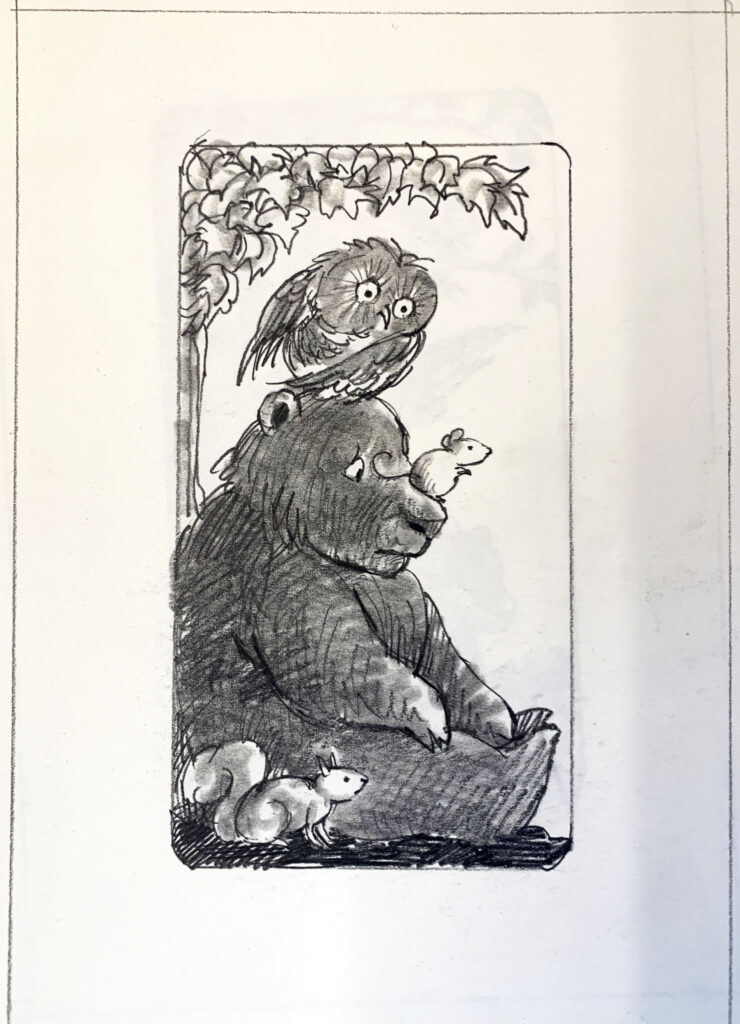
When I visited The Kerlan Collection of Children’s Literature at the University of Minnesota, I was struck, inspired, surprised, and overjoyed, by many things. Seeing artwork created by iconic illustrators was incredible. The subject of my post today was one of the most overwhelming discoveries that I made and I feel an obligation to give this shout out to my fellow illustrators. My post today will pay homage to an unsung calling that we, as illustrators perform and which often goes (in my humble opinion) widely under recognized—
the art of production.
There were production notes written on many of the illustrators’ work that I viewed. But I’m going to feature a few magnificent books by Arnold Lobel.
Present day illustrators are often graphic designers as well as illustrators. It’s buried and hidden in our job description. Sizing the art to allow enough bleed for the page when it’s cropped, considering the gutter, page count and book layout design, understanding capabilities and special effects they might want to utilize, fonts, making certain the type can be read over the illustration, color choices, and trim size. Even if the illustrator is being directed by an art director and/or book designer, the illustrator still must have a fluent understanding of production in order to communicate with their publisher.
And this is today. This is with computers to do extraordinarily amazing things that “back in the day” were either impossible, or incredibly tedious. I’m proud to be in my late 50’s and also proud to say that I was involved in these primitive production techniques. But, as an illustrator, it can often feel burdensome and overwhelming to try to solve a problem that has nothing to do with drawing or painting. And yet, we are supposed to know and be able to do these things? So, when I see one of my beloved favorite artists doing color separations by hand I feel validated. It is uplifting, exciting, and I want to hug Arnold and show all of you what this spectacular artist was required to do, challenged to accomplish— above and beyond drawing his glorious pieces of art and creating endearing characters. I’m going to do my best to give brief descriptions about my photos. I hope that you will find it as interesting as I do.
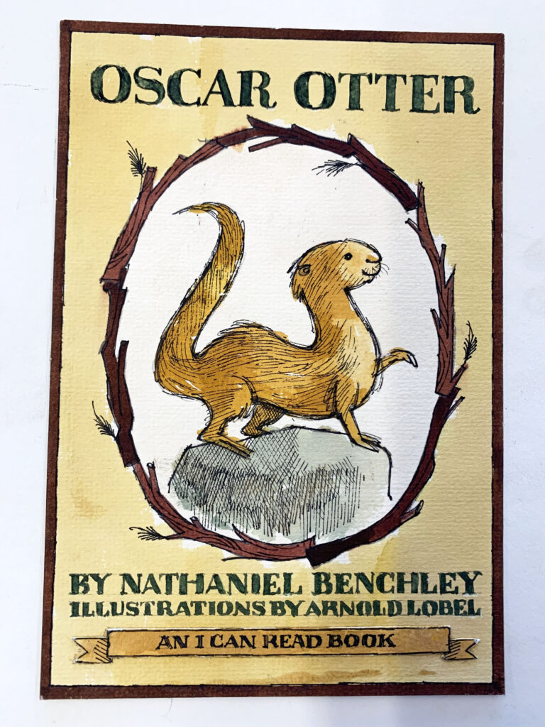
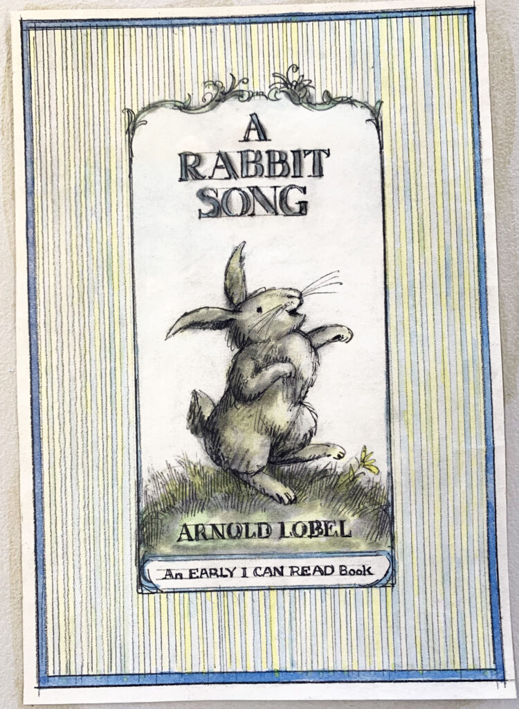
This is a color rough for the cover of Oscar Otter. All painted by hand and the lettering (because pre-computer) drawn by hand. But he is consciously thinking about what style of type he wants to use and showing us this in his design. Upper and lower case letters? Serif or sans serif? He is designing all of this as well as showing us what colors he envisions.
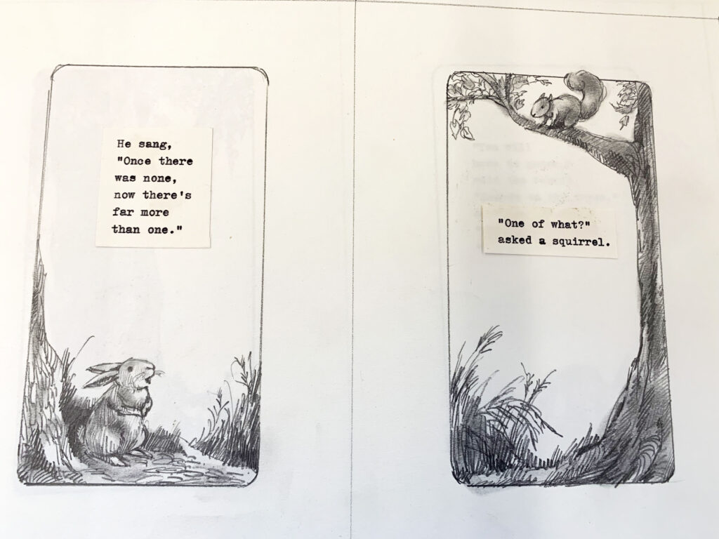
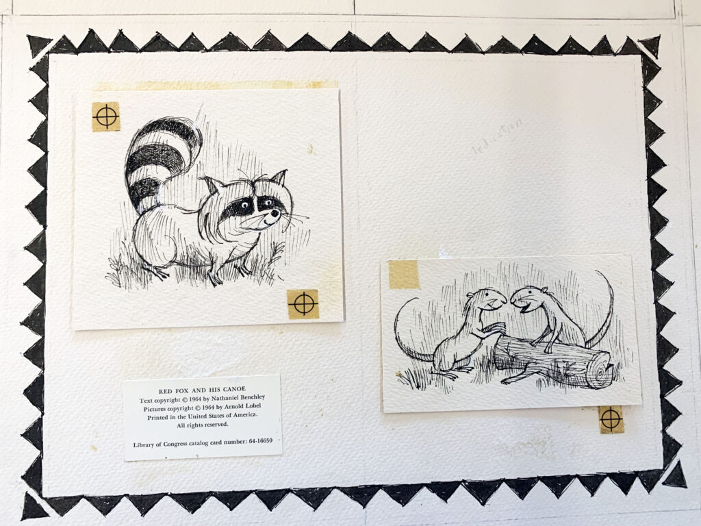
On these pages, Lobel has typed out the text and cut it apart indicating page layouts/text breaks and to enable him to design his art and characters to flow around the copy. I do this today and I’m certain all illustrators do a version of this either in this same hard copy way, or on the computer.
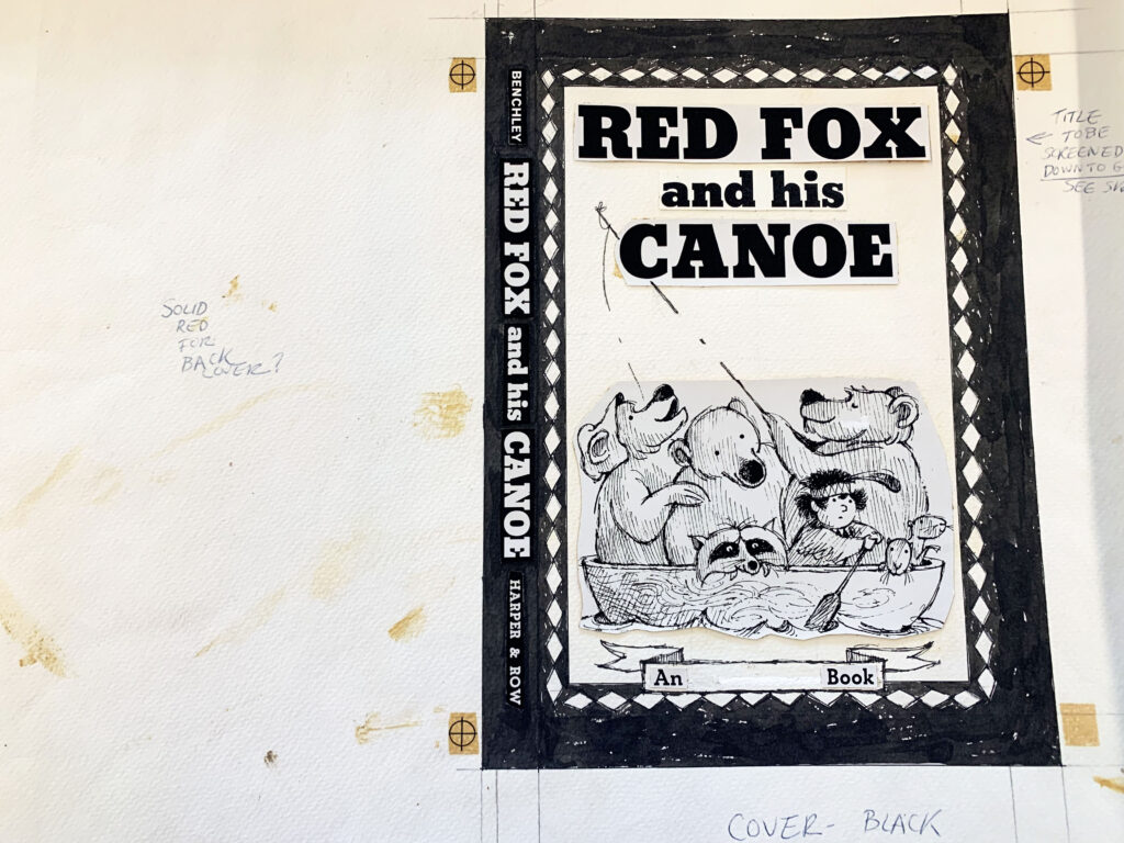
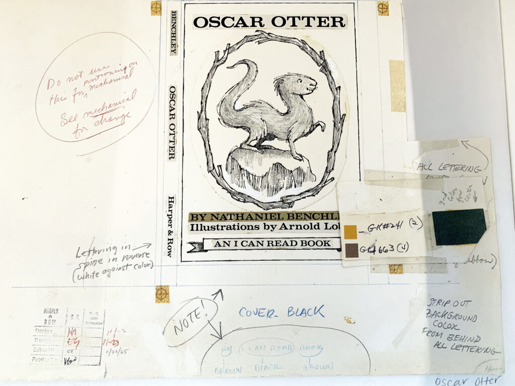
Here is another book cover design by Arnold Lobel. Notice his color indications and that the type and artwork has been printed, cut out, and glued down to the board. From the look of the yellowing on the page, he probably used rubber cement. In my day we used rubber cement as well as melted wax. I know that rubber cement is a nightmare for conservationists.
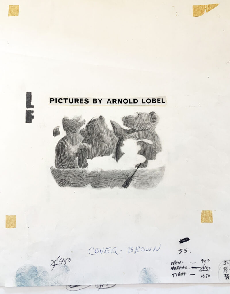
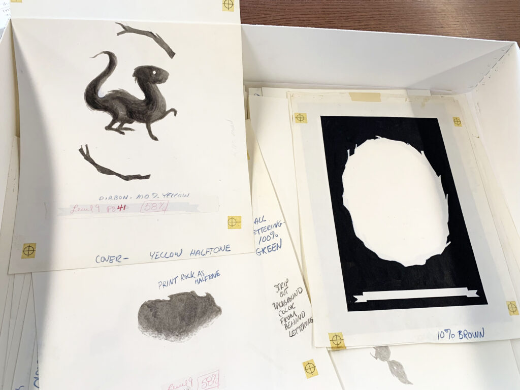
Here is a hand-drawn “brown” color layer for the cover. The previous photo instructs that is the “black” layer.
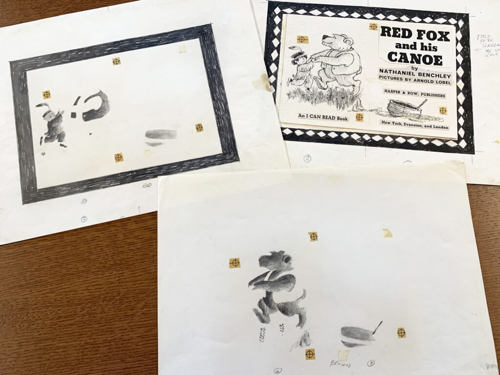
I wonder if this is the title page? Again, showing each layer he needed to draw for each separate color.
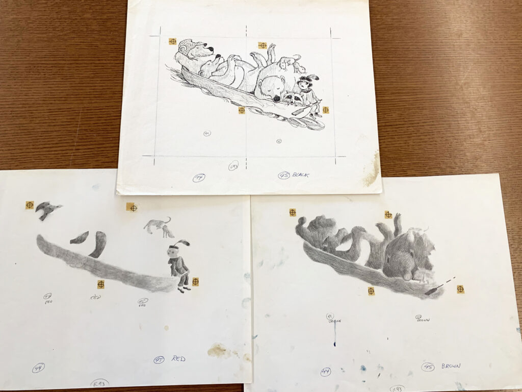
The above photo shows Arnold Lobel’s color layers. Also notice the page layouts and the dotted lines showing the page fold for the spread. A knowledgeable illustrator always considers where the spread will fold and adjusts their artwork so that nothing ‘important’ is lost in the gutter (about 1/2 inch to either side of the centerfold). This needs to be mapped out on the artwork so that that the printer understands how the page should be trimmed and folded.
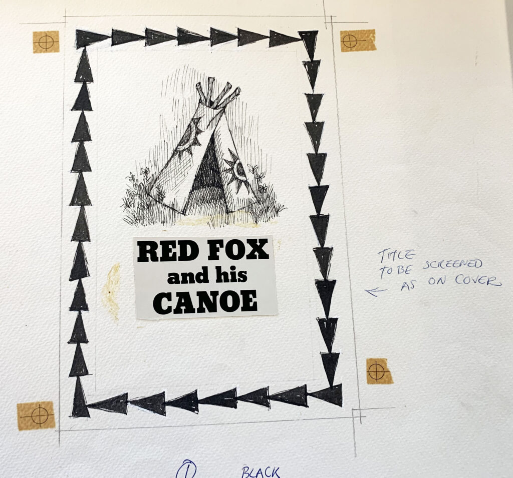
A few more page layouts showing color instruction and text design.
Arnold Lobel wrote and/or illustrated somewhere close to 100 books. As I poured through the boxes of his work I was grateful to see, and am excited to share, the production side of his book-making. I believe it is an important part of what we do as illustrators and picture book makers. And although today computers and printing technology have facilitated and streamlined these techniques, the knowledge and skill necessary to execute them remains the same.
*************************************************************************************Picture Book Builders hit a bit of a glitch and email reminders did not go out to our followers as they usually do. We apologize for any inconvenience and please, look through our list and be sure to catch up on any exciting posts that you might have overlooked 👀!
Jennifer, I too remember the old days of doing things without computers. I’ve been planning a trip to view the Kerlan collection. Arnold Lobel is on my list of artists to view. Thank you for sharing your experience and showing these production pieces. I had not seen any of these books that you featured. Inspired again with the posts here on Picture Book Builders!
You will looooooove your visit, Dorthia! I hope you do a better job of pacing yourself than I did. 😆
Just realized I’m sitting here with my jaw hanging open, gobsmacked. It’s ASTOUNDING so many books found their way onto shelves back then, considering this labor-intensive process. A real labor of love, obviously. THANK YOU for this insight, Jen!
hahaha, thanks, Jill. It was amazing to see how many color layers Arnold Lobel had to create. Cheers to the Kerlan Collection for keeping them safe so that we can all appreciate the entire art of bookmaking for years to come.
From reading Uri Shulevitz’s classes Writing With Pictures, I knew it was a ton of work to create illustrations back in the day, but this is eye-opening post demonstrates it even more clearly! Wow. Thank you for sharing!
Hi Teresa! Yes, even though we have technology now that does a lot of these process steps for us, it still takes a huge team to make a book. Thanks so much for visiting and commenting on PBB today!
Three cheers for all the illustrators who bring our stories to life with all their amazing hard work.
Hip-hip-hooray!
Hip-hip-hooray!
Hip-hip-hooray!
Cheers, Cindy!!!!!! xo
I was astounded when I first learned how books were made with colors separated–it made sense to have a limited color palette and yet how beautiful they are. Thank you so much for this post and for all the work that artists do to bring our stories to life. Truly, a gift. God bless you all.
What kind words, Vijaya, thank you. I like to think that Arnold Lobel would be happy that we notice and appreciate the heavy production load he carried so well. Have a wonderful day!
So cool! I love seeing these works-in-progress!
I’m glad, Angie! Thank you!
I love Arnold Lobel’s books! This was a wonderfully enjoyable post. Thank you.
I’m so happy that you enjoyed the post, Kathy. Thank you very much!
This made me smile, having been an “old school” production artist/designer. And I adore Arnold Lobel’s illustrations.
Loved this Jennifer. Those old paste-ups were a walk down memory lane. I was trained as a “commercial artist” (now called graphic artist/designer) at a high school “vo-tech” in the late 70s and labored over many a paste-up myself. I was still doing some pasting of color overlays (including using a wax machine) at the small town newspaper until nearly the 2000s, where I worked mid-90s to 2007. Can’t quite remember when the wax machine went cold. 2000-ish, I’m guessing. In the mid 90s, the Chrysler Museum in Norfolk mounted an extensive children’s illustration exhibit. This was before I was published but aspiring to write kids’ books. It was so cool to look at notes scribbled by my idols. There was a room in the exhibit devoted to production, but — since I already knew the mid-to-late 20th century paste-up and color separation process — I was disappointed there was nothing about how it was done before THAT. Like how they produced NC Wyeth’s magnificent full-color paintings. Oh well. I guess I could find that out with a little work. Thanks again for the lovely stroll down memory lane!
Astounding!
Amazing!
I learned a lot from this post and came away with an even greater appreciation for all that goes into book production, then and now!
Loved seeing all of this so much! I went to high school in the late 90s so for the high school newspaper, we used computers for typesetting…but not for layout (because the software was way too expensive for the likes of us). LOL! So I am very familiar with the joys of the melted wax machine. So fabulous to have such a special and unique peak into Arnold Lobel’s process! Thank you for sharing.
I was just wondering whether Arnold Lobel did his own color separations, so I googled it and found this, a far better answer than I could have dreamed of! Such a pleasant surprise when the internet is good for something… Thank you!