I’m currently illustrating a picture-book biography about J.R.R. Tolkien (by Caroline McAlister, coming Winter 2017), which is the first book I’m working on that has a significant amount of back-matter, including a bibliography, author and illustrator notes. It’s often the illustrator’s job to pace the story out over 32 pages (or 40, 48, etc.), but I hadn’t thought before about how author notes might affect the visual storytelling of a picture-book’s ending. So I pulled out other books I have with notes in the back to see how they were paced out. How did these book makers end their narrative, and where did they place the back-matter?
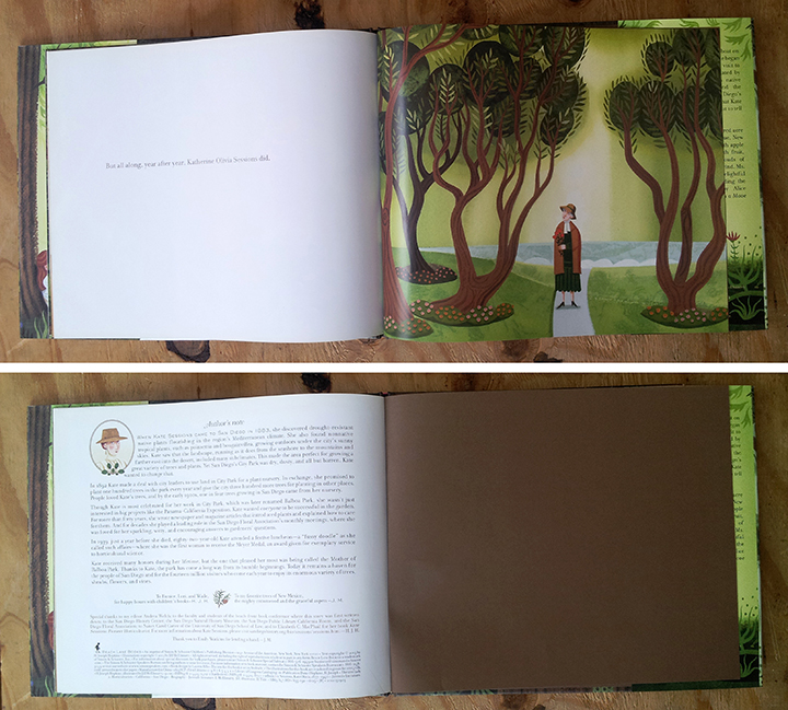
TREE LADY, by H. Joseph Hopkins, illustrated by Jill McElmurry:

This book is a good example of a common ending with one page of notes. It’s a traditional 32-page layout, with the story ending as a last line of text on page 30, the last illustration on page 31, and then the author’s note follows after the last page turn on 32. The printed pages are adhered to a simple brown-colored end paper.
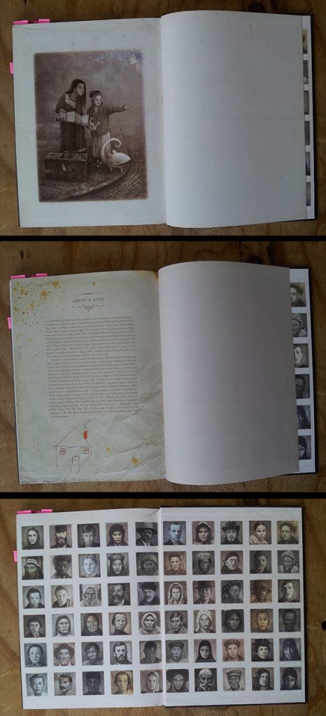
While this book is an unusual 128 pages, the ending still functions like a traditional picture book. Shaun chooses to end the story with one image on the left, and allows the page on the right side to be left blank. This creates the feeling of a natural ending, with notes on the back side of that blank page. The end papers in this example have printed images on them. (see Tammi Sauer’s post ‘Just Right Endpapers’ for more on this topic.)
I learned that there are two different picture-book page layouts:
The first uses colored or patterned end papers of a different paper stock from the printed pages, as in TREE LADY, and THE ARRIVAL, above. The printed book pages are attached to these end papers at the beginning and end, and those papers are adhered to the back of the cover.
The second style is called a ‘self-ending layout’, which means that the printed pages are not adhered to separate end papers, rather, that the first and last pages of the printed book are adhered directly to the cover. See the self-ending layout in the two examples below.
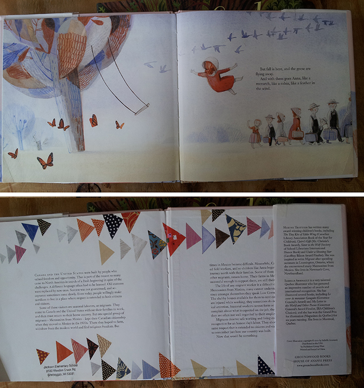
MIGRANT, by Maxine Trottier, Illustrated by Isabelle Arsenault:
This beautiful book has a total of 40 pages, but pages 1 and 40 are the sides glued to the cover. The last spread of the narrative is on 36-37, and the notes follow on pages 38-39, where we usually find the end papers. Personally, I find it to be less than ideal to have notes on page 39, the back of the glued down page, because it feels abrupt; like they ran out of room. Also, as you can see, the cover back-flap covers up a good portion of that page (which feels a little icky). But I also can also understand the choice between space for story and space for notes, and if one has to be compromised, better that it be the note’s space.
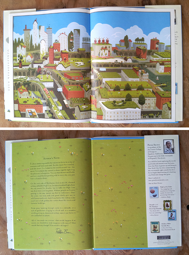
THE CURIOUS GARDEN, by Peter Brown:

THE CURIOUS GARDEN layout is 40 pages, self-ending, like MIGRANT, but the notes are contained on one page (pg 38), so that there is still space left open on page 39, behind the cover. I also love how the last spread of the story is a full, wordless spread, which gives the ending a natural pause before the last page turn and author’s note.
The thing that I notice in all these examples that make them successful is that the final story spread has qualities that slow the story to a stop; a lone line of text, a blank page, or a wordless image.
For more detailed discussion on the difference between end paper layouts and self-ending layouts, I recommend Tara Lazar’s helpful post, Picture Book Dummy, Picture Book Construction: Know Your Layout.
Learning what the options are and how they function for both the story and information that follows is helping me find the most optimal choice for my current project (and hopefully yours, too!). I look forward to sharing the results with you once it comes out!


So interesting! I’m always curious about how back matter is incorporated into books as well. I just grabbed BALLOONS OVER BROADWAY off my bookshelf to see how Melissa Sweet did it–she’s such a master of illustration and book design, and this one (like all her books) is a beauty. And I agree with your comment that putting notes on the pasted down page isn’t optimal. I’m always bummed when jackets are taped down on library books and I can’t see everything on the pasted-down page!
Melissa Sweet is such a great example — I’ll have to take another look at BALLOONS to see how she designed with notes. Thanks Linda!
Great post Eliza! And some of my very favorite books in your examples too. So looking forward to seeing the Tolkein book!! Swan (with 3 full pages of back matter) , The Humblebee Hunters, and The Iridescence of Birds are also great to check out.
Thanks for mentioning these other books, Corinna! IRIDESCENCE OF BIRDS is a great example, and I’ll check out those other two.
Thanks, Eliza–this was fascinating! I’m a huge fan of backmatter, and I love your work. The Tree Lady is one of my favorite biographical pbs too!
I love the backmatter for The Right Word too–it hits all the right notes.
Woops–I forgot to add that I love your work too :)!
Thanks for the sweet comments, Maria! So nice of you!
Thanks, Eliza. I enjoyed seeing your choices of end papers. Some of the picture book stories that I write include notes at the end. When they get published, I hope the illustrator will use clever end papers.
Read this, then rushed to my bookshelves to check out the way more notes were handled. Thanks, Eliza! Something to think about for the nonfiction book ideas I’m working on.
Thank you for the analysis of the different styles of end notes, endpapers and the reminder that publishing is very subjective. I noticed my grandson’s frustration at the information and pictures under the taped back cover flap He solved it by looking at the front end papers and found that they matched. He didn’t have to untape the flap to get the information.
I was just re-reading a fascinating 2012 Horn Book article by Robin Smith despairing of unfortunate book jacket/end paper combos (e.g. MIGRANT photo above). If you’re interested: http://www.hbook.com/2012/10/blogs/calling-caldecott/things-that-make-me-cry-real-tears/
Thanks for this wonderful post, which I think will generate some buzz for our book. I continue to be impressed by all of the careful thought you are putting into planning the illustrations. The idea of the final spread slowing the story to a stop is beautiful. Can’t wait for 2017.